|
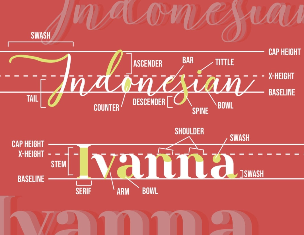
"Indonesian Ivanna" TypographyMy name is Ivanna. I'm Indonesian. It's as simple as that. Typography? Not quite. With every swash, tail, bar, spine, bowl, arm, and serif, every decision when choosing a font is fundamental in order to achieve the message a piece represents. This piece in particular displays everything there is to typography.
Size: 11 x 8.5 inches
Medium: Digital Media |
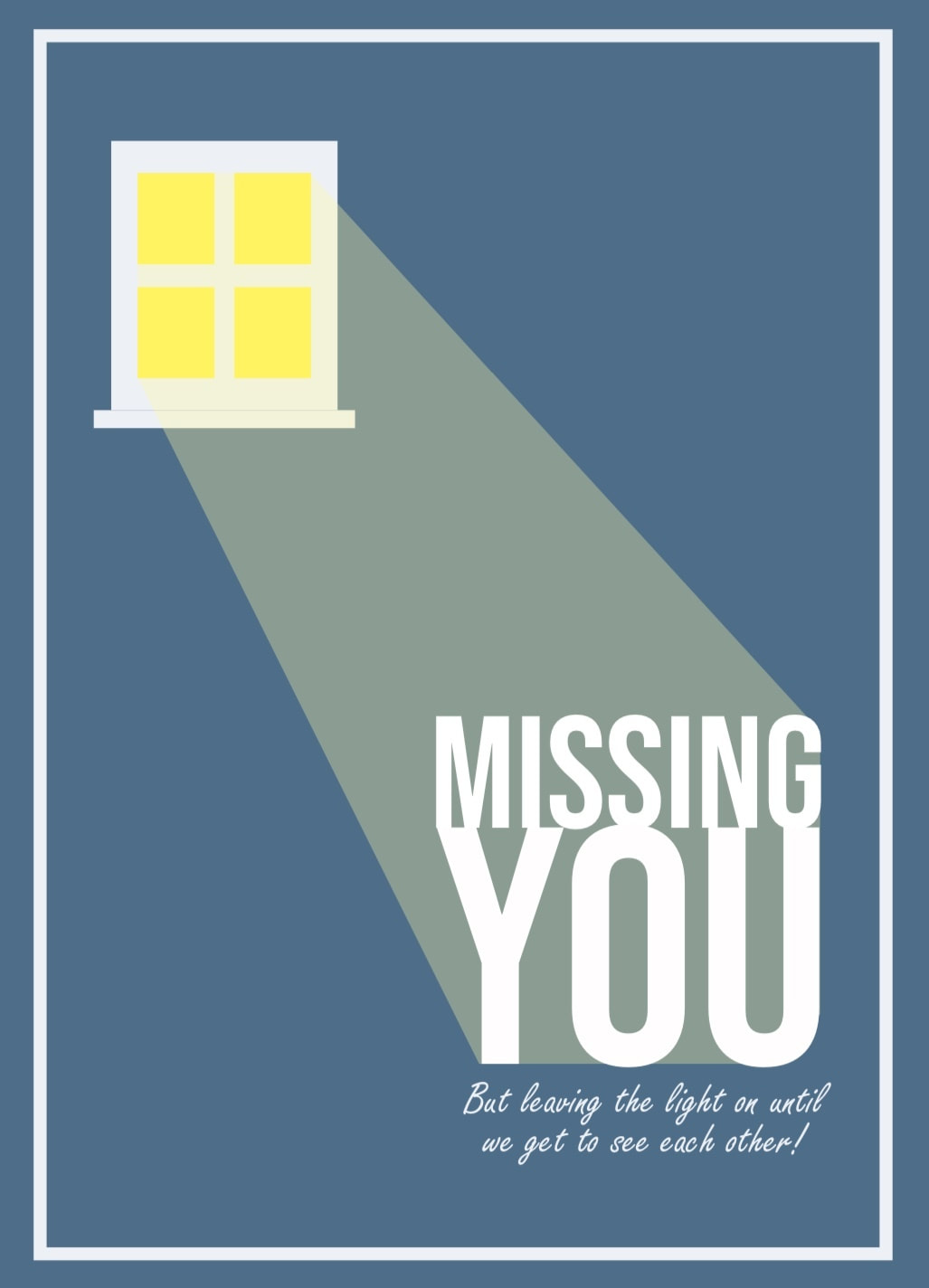
"Missing You" Cover Card"Missing you, but leaving the light on until we get to see each other!" A short, but meaningful, message that the world needs to hear especially during this pandemic. As long as the world keeps its lights on for each other, things will start looking up - or should I say, brighter?
Size: 5 x 7 inches
Medium: Digital Media |
|
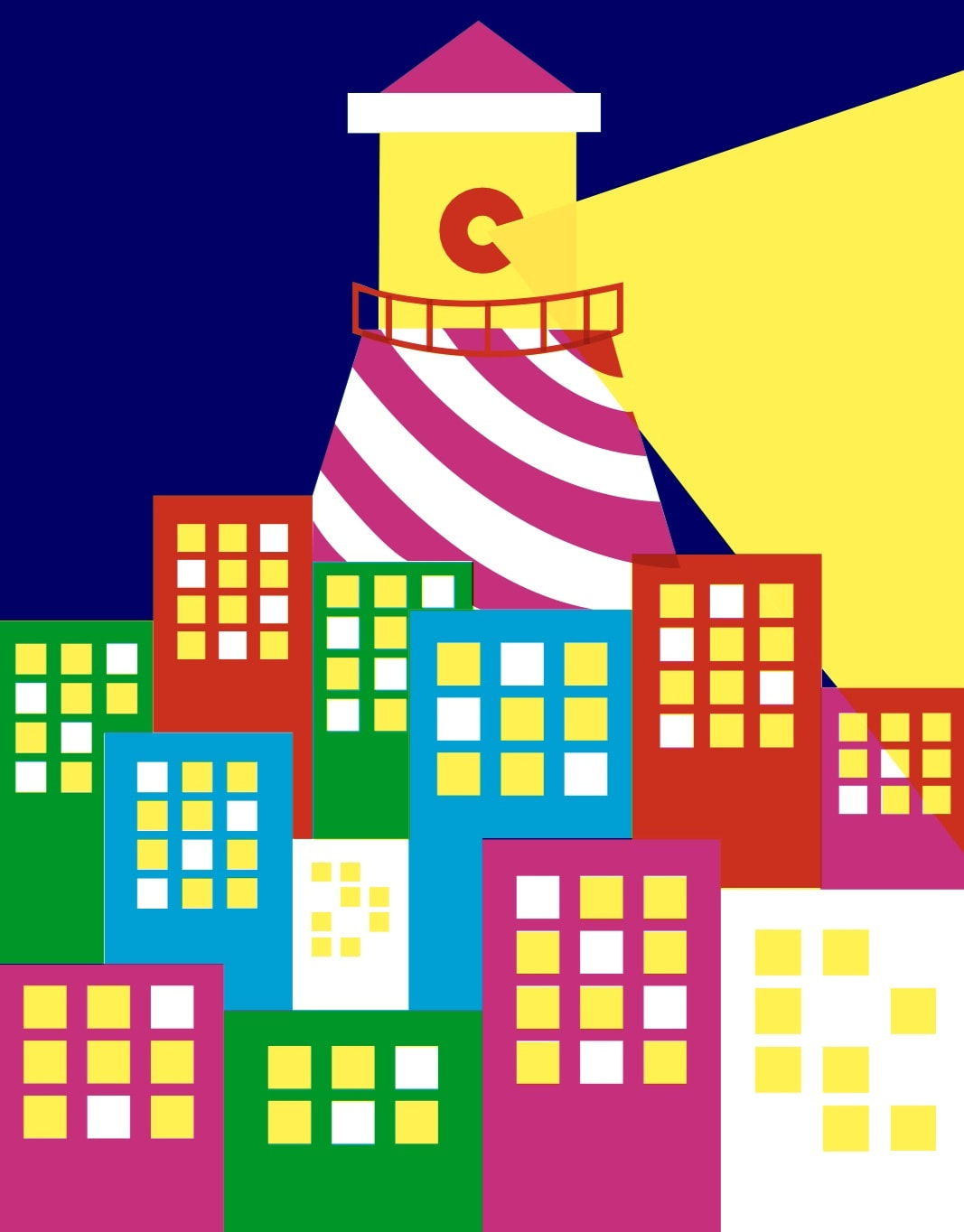
Size: 11 x 14 inches
Medium: Silk-Screen Printing |
Final silk-screened piece
"Omi""Omi" is an art piece inspired by Lin-Manuel Miranda's musical "In the Heights" and is dedicated to my late grandma, Omi, and my family in Indonesia. The musical and my art piece shares the message of family and a home away from home. This piece was first digitally designed on Adobe Illustrator before I went through the process of silk-screen printing.
|
"Omi" framed in The Arnold O. Beckman High School Gallery (2019)
A laser cutter was used to cut out a stencil of my artwork before I silk-screened with three types of silk-screening inks: cyan, yellow, and magenta. I did take some creative liberties with the prompt of the assignment because I wanted to make sure I could accurately express the inspiration behind this art piece and dedicate my artwork to my family from the heart.
|
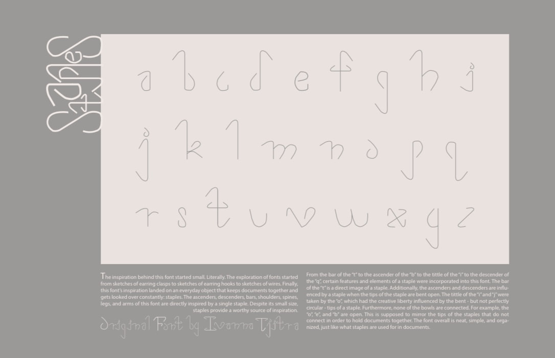
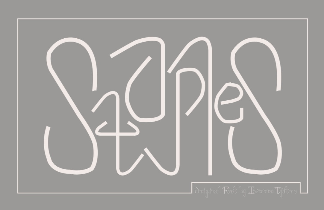
"Staples" Alphabet
"Staples" FontThe inspiration behind this font started small. Literally. The exploration of fonts started from sketches of earring clasps to sketches of earring hooks to sketches of wires. Finally, this font's inspiration landed on an everyday object that keeps documents together and gets looked over constantly: staples. The ascenders, descenders, bars, shoulders, spines, legs, and arms of this font are directly inspired by a single staple. Despite its small size, staples provide a worthy source of inspiration.
Size: 11 x 8.5 inches
Medium: Digital Media |
From the bar of the "t" to the ascender of the "b" to the tittle of the "i" to the descender of the "q", certain features and elements of a staple were incorporated into this font. The bar of the "t" is a direct image of a staple. Additionally, the ascenders and descenders are influenced by a staple when the tips of the staple are bent open. The tittle of the "i" and "j" were taken by the "o", which had the creative liberty influenced by the bent - but not perfectly circular - tips of a staple. Furthermore, none of the bowls are connected. For example, the "o", "e", and "b" are open. This is supposed to mirror the tips of the staples that do not connect in order to hold documents together. The font overall is neat, simple, and organized, just like what staples are used for in documents.
|
Size: 11 x 17 inches
Medium: Digital Media |
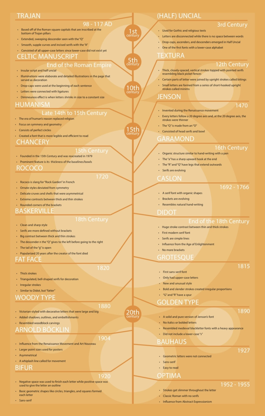
"Gutenberg Textura"-themed Font Timeline
|
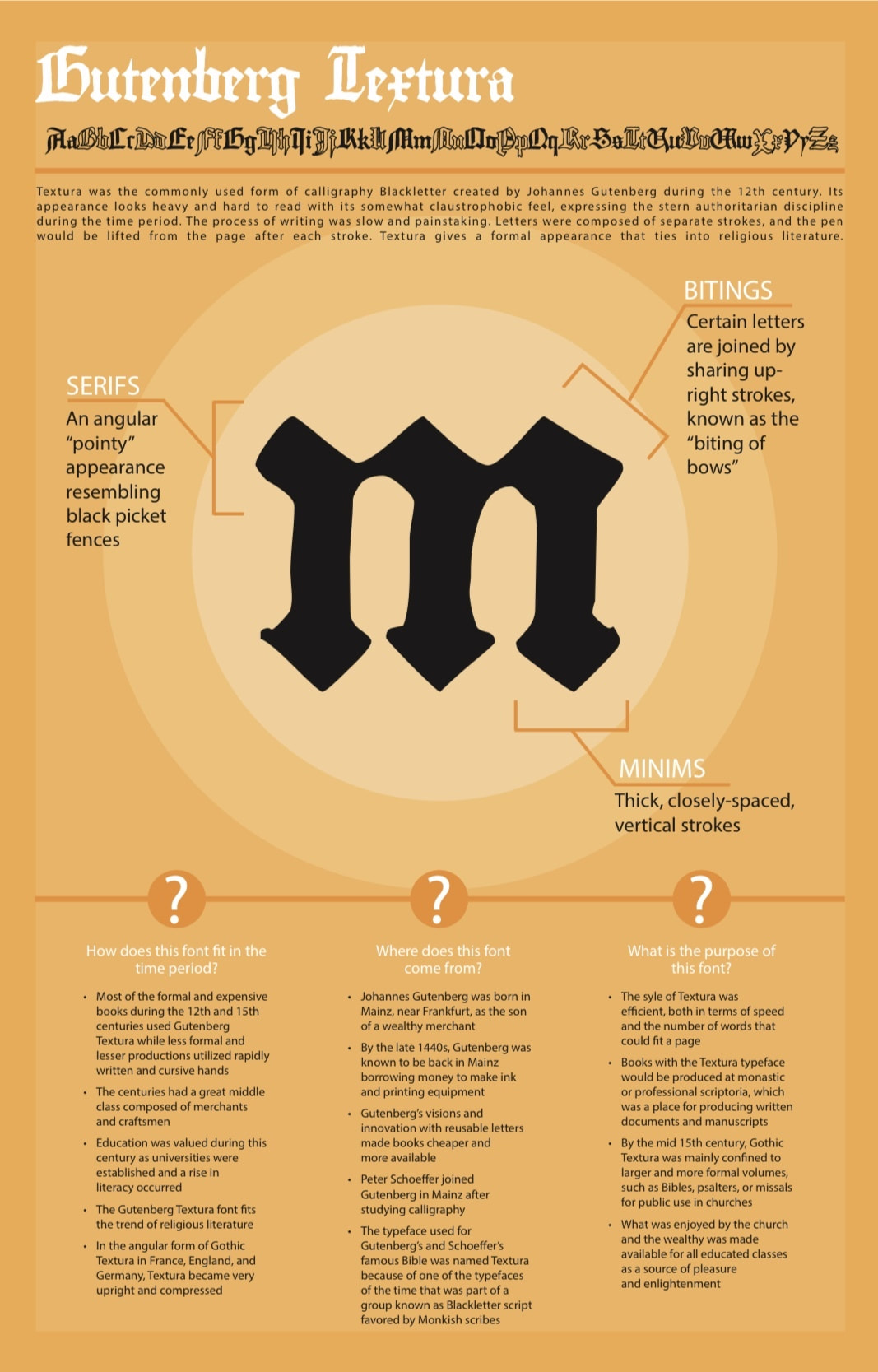
"Gutenberg Textura" InfographicTextura was the commonly used form of calligraphy Blackletter created by Johannes Gutenberg during the 12th century. Its appearance looks heavy and hard to read with its somewhat claustrophobic feel, expressing the stern authoritarian discipline during the time period. The process of writing was slow and painstaking. Letters were composed of separate strokes, and the pen would be lifted from the page after each stroke. Textura gives a formal appearance that ties into religious literature. Its serifs had an angular "pointy" appearance resembling black picket fences. Certain letters were joined by sharing up-right strokes, known as the "biting of bows". Textura had thick, closely-spaced vertical strokes that were referred to as minims.
|
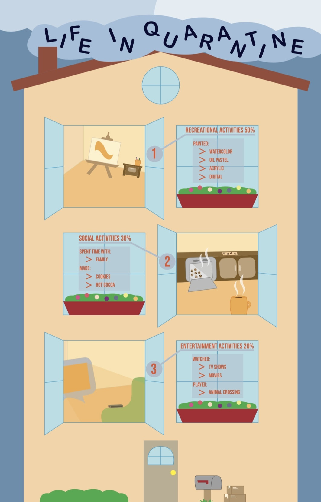
"Life in Quarantine" Infographic
|
Size: 11 x 17 inches
Medium: Digital Media |
|
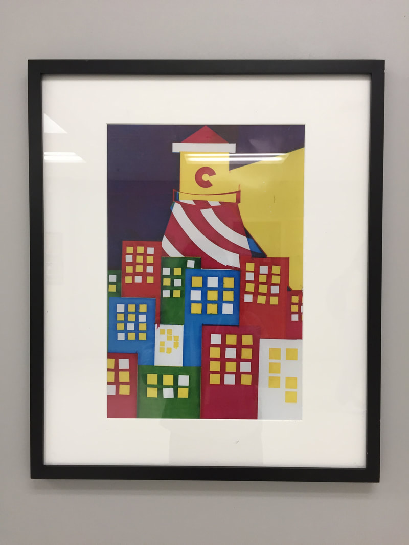
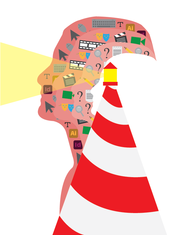
"Layers" Self Portrait“Layers” is a piece created in an image of a self portrait. I am proud to call myself a journalist, filmmaker, and graphic designer with my experience throughout my high school career. The layers within this piece holds icons and designs that resemble each person that creates me. The outer layer portrays the graphic designer in me, the middle layer portrays the filmmaker in me, and the inner layer portrays the journalist in me. The lighthouse is red and white, the same colors of the Indonesian flag. All my life, I saw Indonesia as a distant lighthouse beaconing my home to where my extended family lives. However, I realized that the lighthouse is within me as I am a cumulation of my family and me. I am a multi-layered storyteller who illuminates the stories within the cracks of my life.
Size: 8.5 x 11 inches
Medium: Digital Media |
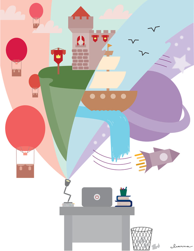
"Can You Imagine That?" PosterI really wanted to share the message of how finding imagination in the mundane can transport us to different worlds outside of our own lives and how it really only takes one small idea, like a lightbulb, to ignite that imagination. I paid attention to the color scheme and color harmonies, including a red-green, blue-orange, and yellow-purple complementary color harmony to contrast with the gray tones of the desk life.
Size: 8.5 x 11 inches
Medium: Digital Media |
|
